Case study · Brand identity · Packaging
Nightjar Coffee
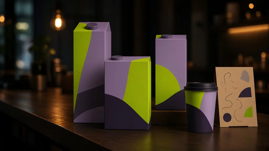
A night-owl coffee roaster needed a brand as bold as its late-night roasts. We built a shape system that stacks like a city skyline after dark.
- Client
- Nightjar (fictional)
- Role
- Design lead
- Year
- 2026
- Scope
- Identity, packaging, signage
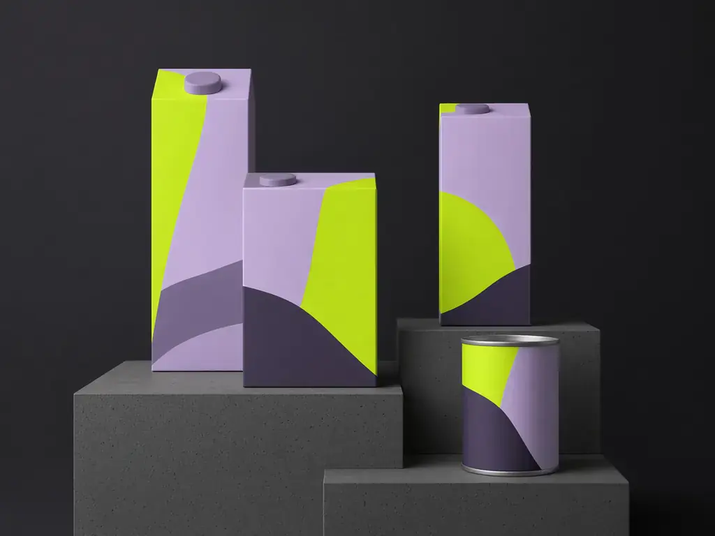
The challenge
Nightjar roasts in small batches after the café closes. Their old packaging looked like every other speciality brand: kraft paper, a thin logo, a lot of whitespace.
The brief was simple: stand out on a crowded shelf, feel playful rather than precious, and be cheap to print in short runs.
The approach
- 01
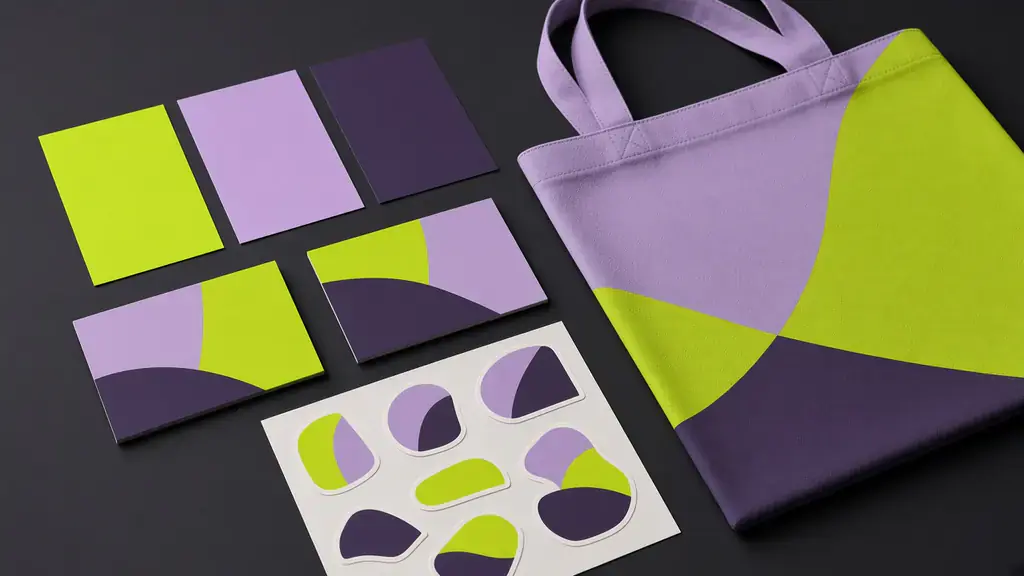
Four shapes, endless skylines
A square, a quarter circle, a slab and a moon. Each blend gets its own stack, so the shelf reads like a city at night.
- 02
Two inks, maximum contrast
Lime and lilac on charcoal stock. Two-colour printing keeps short runs affordable and looks loud from across the room.
- 03
A wordmark that winks
Wide, confident letters with a little crescent tucked into the J, a nod to the bird the roaster is named after.
Palette
Lime · #D4FF3A
Lilac · #B9A6FF
Coal · #1C1B24
Typography
Aa*
Syne ExtraBold for headlines, Manrope for everything else.
“The new boxes finally look like the coffee tastes: a bit loud, a bit late, and very us.”
Next project
Tidepool